NaN:NaN
NaN:NaN
--:-- / --:--
Newgrounds Background Image Theme

Eroliniart just joined the crew!

We need you on the team, too.

Support Newgrounds and get tons of perks for just $2.99!

Create a Free Account and then..

Become a Supporter!

Requesting general art feedback.

137 Views | 7 Replies
New Topic Respond to this Topic

Hi art portal. I found out roughly last week that I had been unscouted-- I'm positive this one is on me, I'm just not sure exactly what I'm doing that could be tweaked up to match the quality standards.

I *could* just flail around until I do something right but I'd rather humble myself and find out how I'm doing things wrong.

I'll link some of my more recent/better images to give an idea of what I can do when I'm serious about a piece

img 1

img2

img 3


(also not actually related how do i embed art posts like i see some people do those links look ugly)


BBS Signature

Response to Requesting general art feedback. Mar 30, 2025


At 3/30/25 09:27 PM, lunorats wrote:Hi art portal. I found out roughly last week that I had been unscouted-- I'm positive this one is on me, I'm just not sure exactly what I'm doing that could be tweaked up to match the quality standards.


Well, I don't rightly know, some moderators might have their own biases. I don't think "Summer Demon" is so bad. I get what "Bev Ramos" is going for and I kinda like it, but it's also very vague and the line work I can see isn't that interesting by itself (no fingers for one.) I also get what "Violence" is going for, but it's very blurry, vague, and messy. Some parts are clearly very detailed! But overall it struggles to convey a whole, if that makes sense.


Overall probably needs to be clearer and have more conventional composition. Could just be someone who doesn't like the more experimental stuff.


I take no responsibility for the above. It's your fault for reading it.

Response to Requesting general art feedback. Mar 30, 2025


At 3/30/25 10:42 PM, SHITBAGxDETON8R wrote:
At 3/30/25 09:27 PM, lunorats wrote:Hi art portal. I found out roughly last week that I had been unscouted-- I'm positive this one is on me, I'm just not sure exactly what I'm doing that could be tweaked up to match the quality standards.

Well, I don't rightly know, some moderators might have their own biases. I don't think "Summer Demon" is so bad. I get what "Bev Ramos" is going for and I kinda like it, but it's also very vague and the line work I can see isn't that interesting by itself (no fingers for one.) I also get what "Violence" is going for, but it's very blurry, vague, and messy. Some parts are clearly very detailed! But overall it struggles to convey a whole, if that makes sense.

Overall probably needs to be clearer and have more conventional composition. Could just be someone who doesn't like the more experimental stuff.


hmm i see!

I can see all of that making sense-- technically the Bev one *does* have fingers but since there's a censor bar since they're flipping the bird I could see that confusing it

Violence was more of a "bit off more than I could chew" deal--- it's supposed to be a "medley" image that shows all the major parts of the levels but I really struggled to transition the pieces together

Thanks for the feedback!! Will be keeping this in mind for upcoming pieces-- could probably stand to find a general formula and stick with it for drawings


BBS Signature

Response to Requesting general art feedback. Mar 31, 2025


At 3/30/25 09:27 PM, lunorats wrote:Hi art portal. I found out roughly last week that I had been unscouted-- I'm positive this one is on me, I'm just not sure exactly what I'm doing that could be tweaked up to match the quality standards.
I *could* just flail around until I do something right but I'd rather humble myself and find out how I'm doing things wrong.
I'll link some of my more recent/better images to give an idea of what I can do when I'm serious about a piece


There are "raw" uses of digital tools (using stuff like gradients, smudge, blur, noise, filters, etc. with the intention of having them stick out and not integrate with the overall piece) that can, in some cases, help a piece. For these though, they feel less intentional, just undercooked. For some of these, it feels like you want to hide your work behind a barrage of digital noise rather than use effects to enhance a central image that you're proud of. The case of Violence is a little different in the sense that you're overusing the smudge tool rather than hiding things, but in all cases, it gives the impression that you're just experimenting with tools and you're not really planning anything. You play around, get results that you couldn't predict, and at some point you choose a stopping point, and that's what you post. That still counts as art, but it's not ideal if you're looking to reach an audience.


I'm not sure just a tweak is going to instantly put you on a preferable path, I wouldn't tell you to stop experimenting, but the kinds of things that I'd have you start doing are pretty big changes. Learning basic fundamentals requires an entirely different mindset because it covers things you can't just intuit and guess at anymore. Planning a composition requires a lot more care and attention, often requiring you to reference how others succeed, so if you're exclusively inside your own head every time you draw, just looking at references is going to be a big change. They're not difficult things to do, but it'd be a big departure from your current mindset. Maybe you're ready for that, I dunno.

Response to Requesting general art feedback. Mar 31, 2025


Agreeing that it may seem like you're burying your art under lots of post-processing rather than creating a cohesive piece. The amount of blur and smudging makes the forms feel muddy.


Its gonna sound lame but yeah, just dive into fundamentals and they'll loop back into improving more experimental art


Illustrator and tabletop roleplaying game designer. Check out my work at Bsky!

BBS Signature

Response to Requesting general art feedback. Mar 31, 2025


At 3/30/25 09:27 PM, lunorats wrote:Hi art portal. I found out roughly last week that I had been unscouted-- I'm positive this one is on me, I'm just not sure exactly what I'm doing that could be tweaked up to match the quality standards.
I *could* just flail around until I do something right but I'd rather humble myself and find out how I'm doing things wrong.
I'll link some of my more recent/better images to give an idea of what I can do when I'm serious about a piece
img 1
img2
img 3

(also not actually related how do i embed art posts like i see some people do those links look ugly)


What have already been said by others in this thread

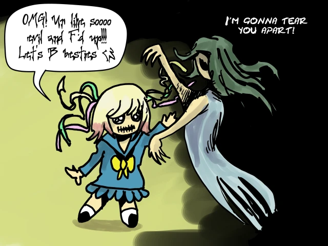
+ a redraw of one of your pieces as a practical example.


(to make this kind of link just copy and paste the address to your submission without any formation)


iu_1376705_8016576.webp


Keeping it simple, clean lines, attention to form and having the two characters interacting.


The fonts I've used are 'creepygirl' and 'cracked johnny'. Two good and free to use fonts that works well for crazy characters.


(I'm pretty sure an inter-dimensional flesh monster wouldn't say 'Dude'. )


See my profile page for link to showroom

BBS Signature

Response to Requesting general art feedback. Mar 31, 2025


At 3/31/25 12:23 AM, Skoops wrote:
At 3/30/25 09:27 PM, lunorats wrote:Hi art portal. I found out roughly last week that I had been unscouted-- I'm positive this one is on me, I'm just not sure exactly what I'm doing that could be tweaked up to match the quality standards.
I *could* just flail around until I do something right but I'd rather humble myself and find out how I'm doing things wrong.
I'll link some of my more recent/better images to give an idea of what I can do when I'm serious about a piece

There are "raw" uses of digital tools (using stuff like gradients, smudge, blur, noise, filters, etc. with the intention of having them stick out and not integrate with the overall piece) that can, in some cases, help a piece. For these though, they feel less intentional, just undercooked. For some of these, it feels like you want to hide your work behind a barrage of digital noise rather than use effects to enhance a central image that you're proud of. The case of Violence is a little different in the sense that you're overusing the smudge tool rather than hiding things, but in all cases, it gives the impression that you're just experimenting with tools and you're not really planning anything. You play around, get results that you couldn't predict, and at some point you choose a stopping point, and that's what you post. That still counts as art, but it's not ideal if you're looking to reach an audience.

I'm not sure just a tweak is going to instantly put you on a preferable path, I wouldn't tell you to stop experimenting, but the kinds of things that I'd have you start doing are pretty big changes. Learning basic fundamentals requires an entirely different mindset because it covers things you can't just intuit and guess at anymore. Planning a composition requires a lot more care and attention, often requiring you to reference how others succeed, so if you're exclusively inside your own head every time you draw, just looking at references is going to be a big change. They're not difficult things to do, but it'd be a big departure from your current mindset. Maybe you're ready for that, I dunno.


this is perfect, actually. My current workflow has been come up with idea>sketch an outline till im happy>color it in>screw with filters until it matches the vibe im going for--- which while I enjoy that I could see how it isn't practical. Heck, I don't even make a body proportion outline half the time I just go straight into drawing.

Thank you for the feedback, seriously.


BBS Signature

Response to Requesting general art feedback. Mar 31, 2025


At 3/30/25 11:11 PM, lunorats wrote:hmm i see!
I can see all of that making sense-- technically the Bev one *does* have fingers but since there's a censor bar since they're flipping the bird I could see that confusing it
Violence was more of a "bit off more than I could chew" deal--- it's supposed to be a "medley" image that shows all the major parts of the levels but I really struggled to transition the pieces together


Yeah, the Bev one is a bit too low-detail to convey that it's even a censor bar, since there's not much detail in general I thought it was a phone or something... Faces and hands are both pretty important to convey moods and actions, skimping on either can be pretty dangerous I think. Violence shows some kind of ambition but you should try some of the piecemeal scenes and maybe stitch them together in some form later?


To play Devil's Advocate, a lot of people will say stuff like "everything is art and has equal value" but to most people it's very easy to tell when something has things like consistent proportions, well-done details, and nice rendering, and it's just as obvious that taping a banana to a wall is lazy and dumb even if it's a statement about something. You don't always need to follow specific rules but it can help to have an understanding of why people do certain things.


I ignore conventions and do dumb crap all the time, though.


I take no responsibility for the above. It's your fault for reading it.