NaN:NaN
NaN:NaN
--:-- / --:--
Newgrounds Background Image Theme

ErosChroma just joined the crew!

We need you on the team, too.

Support Newgrounds and get tons of perks for just $2.99!

Create a Free Account and then..

Become a Supporter!

Critique Call Center: Want your art critiqued? Want to critique art? Look here!

5,193 Views | 153 Replies
New Topic Respond to this Topic

At 3/16/25 01:37 AM, IamNoOneSpecial1 wrote:
At 3/15/25 10:21 PM, SpicyShark wrote:
At 3/15/25 05:36 PM, SpicyShark wrote:
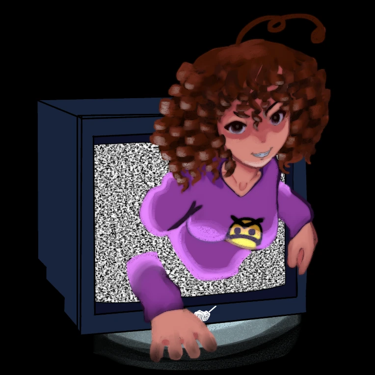
What I tried doing here was applying what I learned from my more “realistic” anatomy practices to my art style hoping to improve it, mainly to get a better understanding of anatomy fundamentals but I added I also tried to make the shading and hair shine colors look more natural. But I can definitely see it being improved in some areas, the shading and hair shine colors especially. Tips on anatomy improvement would be appreciated too, wouldn’t mind doing more practice

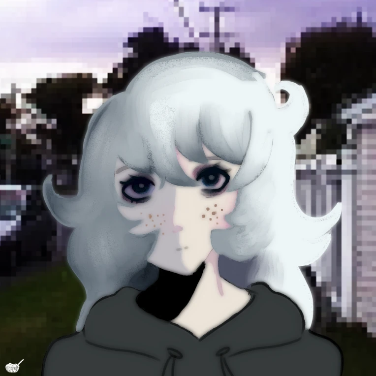
I just realized I forgot to put shines on her skin… damn it dude. Or what are they called? Doesn’t matter I get the idea

They are called highlights or tints.


Thank you I have like 2 brain cells


how much my art you think is worth? it can be robux or real currency like dollars or euros


iu_1369420_24214694.webp


iu_1369421_24214694.webp


just put the fries in the bag bro

BBS Signature

At 3/16/25 12:59 PM, CornflakesIntestines wrote:how much my art you think is worth? it can be robux or real currency like dollars or euros


I'll pass on the abstract and just give a crit.

You're thinking about light and shadow but it seems like you're not comfortable letting full planes of your volumes get lit, only the bits that are closest to the light source. When you're rendering something that's purely in the foreground, try to think less in terms of how far away something is from the light source, and think more about whether its surfaces are facing that light source or not. Facing the light = lit, not facing the light = not lit. It's not "light comes from right, therefore everything is lighter on the left and darker on the right."


In the first image, their left arm and lower torso would be catching a lot more light, and if the television is the only light source, the rest would be in much stronger shadow. There's suggestion of bounce light on the skin, but nowhere else, so I can't tell what you were going for. Just seems like you're afraid to use as much contrast as the scene calls for.


But speaking of strong shadows, on your second image, the hair is very subtly shaded while the skin immediately ramps to pure black on the neck, and the hoodie has neither soft nor hard lighting, so basically every material has a wildly different treatment that doesn't look intentional. In an overcast setting, light is diffused and soft, meaning less dramatic shading on everything.


At 3/15/25 06:56 PM, frym wrote:[CRITIQUE THIS]

Some recent pieces, ik I have a lot to improve on in terms of fundamentals, anatomy, shading, etc, but I wanna know other people's thoughts :)

Shapes are pretty good. A little wobbly here and there, but there's decent gesture going on that kinda saves it. Your soft shading feels more like an ambient occlusion pass than what I'd expect with a directional light source, but you're doing simple work and I don't think full rendering is your goal.


If you're studying gestures, keep at it. That ought to help with construction and viewing your own work with more of an eye for 3D volumes.